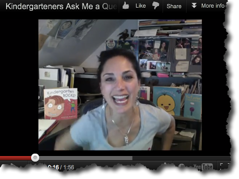
I’m at the Highlights Foundation Founders Workshop this week as faculty in their Making the Web Work for You week. One of the things I’m teaching is all about book trailers. Book trailers need as much editorial viciousness as manuscripts. Trailers should be short, grab the viewer, and be compelling to watch. A click is all it takes to turn away from all your hard work! Here are three (of many) stages of this one minute trailer. The first version was 1:12, which I finally pared down to an acceptable 1:03. Part 2 of this two parter will appear on Thursday, covering details of how I created this trailer.
Below is the first version. Because this is a book about promoting your book in a non-pushy way, I thought it would be funny to create a trailer that was a stereotypical pushy 50’s type commercial. I started using my own voice as scratch – I knew I wanted a male voice over eventually, in the style of an old 50’s commercial. Can you see what I edited out and why?
Note: I use Screenflow to edit all my videos. If you like what you learn on my blog and are interested in buying Screenflow, it would help me a lot if you were to use my affiliate link to purchase it.
Stage 1
Stage 2
In this stage I added a “character” to follow, so that there is a cohesiveness to the story. Yes, in only a one minute trailer, you can (and should) build a story!
Final version
The previous character was wrong. She was too young, and I couldn’t find the right expressions. I found a whole bunch of episodes from a goofy old TV series called Meet Corliss Archer and was thrilled to find the mom because she’s so expressive and so fifties she fit right in. Love that shoulder shrug at the end – almost looks like a parody of itself!


2 Comments
Julie Falatko
You know, I never would have thought about how having a character (esp.in a one-minute video) could make a difference, but it does somehow make it all flow better and make more sense.
Penny Klostermann
I loved seeing the progress.