Right before I met my site designer, Chad Tomlinson, I learned about one mistake I’d made with my previous site. I had used a hybrid designer/programmer. I’m sure there are programmers who do both well, and my last site was impressive in its prehistoric day, but this time I wanted someone who specialized in design and I wanted another person who specialized in programming.
Early on I gave input as to what I thought was most important for me to have front and center, or as they say in newspaper parlance, “above the fold,” which means the first thing a visitor sees without having to scroll down. I made it clear I wanted my site to feel Katie-ish, be fun, informative, yet very professional without being in the least bit stuffy. And I wanted it very 2011 with the ease of making it very 2012 when the time came, and 2013, and so on.
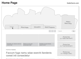
I told all this to Chad, and here is the sketch he sent me—the first stage of this site, called the “wireframes” (and note, at the time of this writing, I don’t even have my home, or splash page up yet!)

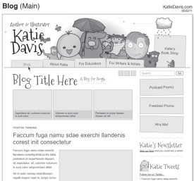
I made changes and suggestions, then after a few more back-and-forths, Chad sent me this version, which is the 4th:

Step-by-step, it got closer and closer to being finalized until I was submitting art to him for the various spots. If you’re not an artist, do not fret! Go check out istockphoto.com, which is where I buy a lot of images for my presentations. For a site you can use the small size, and many are just $2-$3 each.
Chad put together the header—that banner like image at the top of every page—and came up with the idea to have the little characters on the sides. He suggested colors and in fact, and only by accident, recorded his work over time! Check this out. I think it’s fascinating to watch his thought process evolve! What do you think?
Tomorrow, Chad gives tips and secrets to great site design.


2 Comments
Brenda Ferber
Love that video. So cool to see all the thought that went into the design!
katie
So glad I’m not the only one who thinks it’s cool to watch that! As creative people who sweat over every word or art piece, I get what he’s doing. Because we work alone so often, it’s great to see even someone on Chad’s level is moving things around even nano-inch by nano-inch to see what works best!